What Are Travel Brochures and How to Make Them Work
Nick · Published 14 August 2026
Travel brochures are still doing real work. A 2018 visitor survey found that 79% of visitors picked up a brochure during travel, 73% were influenced by one at their destination, and 85% became aware of an attraction or business because of a brochure they picked up survey PDF. That's not a nostalgic leftover from the print era, it's a reminder that people still use a brochure when they want fast, local, decision-ready information.
A travel brochure is a promotional document, printed or digital, that advertises a destination, tour, hotel, or travel experience by combining imagery with practical details. In the pre-digital era, it was often the main planning tool, and travel agents relied on it for itinerary details, maps, departure dates, and prices historical print context. Today, the format still matters because it compresses inspiration, orientation, and booking confidence into one artefact.
The best brochures don't try to do everything. They guide a traveller from “this looks appealing” to “I know where it is, what it costs, and how to book”. That's why the format still sits at the centre of tourism marketing, even when the delivery method has changed.
Table of Contents
- Why Travel Brochures Still Matter in 2026
- The Standard Structure of a Travel Brochure
- Print Brochures Versus Digital Brochures
- Building Trust Beyond Polished Imagery
- Production Specifications and Design Rules
- Distributing Brochures as Trackable Assets
- From Concept to Distributed Brochure
Why Travel Brochures Still Matter in 2026
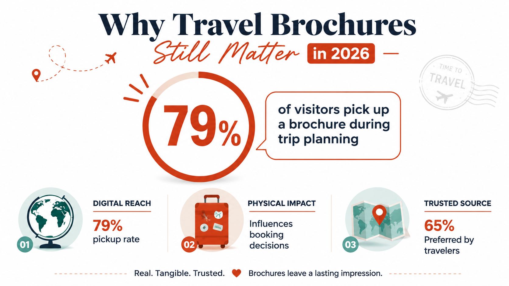
Brochures aren't peripheral in tourism, they're part of how people decide what's worth their time on the ground. A separate tourism survey reported that 7 out of 10 tourists and visitors picked up brochures at their destination, 53% used brochures to plan before arrival, and brochure influence from a display stand (69%) slightly exceeded websites (68%) for arriving tourists visitor survey data. That matters because a brochure often catches the traveller at the exact point where they're ready to choose.
What a brochure actually does
The format isn't just informational. It's a decision-support document that mixes destination imagery with practical information, so the reader doesn't need to hunt across tabs, apps, and PDFs to work out what to do next. That's why brochures show up in visitor centres, hotel lobbies, airport arrivals, and attraction desks, they meet people where intent is already high.
Historically, brochures were a foundational mass-market channel for travel commerce. United Airlines planned to spend around $1 million on brochures in a single year in 1977, the Swiss National Tourist Office expected to distribute 75 tons through offices in New York and Chicago, and major German travel companies spent about 80% to 90% of advertising budgets on catalogues from the 1960s to the 1980s Travel Weekly history. That scale makes sense when you think about the job: one piece has to sell, orient, and reassure.
Practical rule: if a brochure doesn't help someone decide, it's just decoration.
The strongest brochures still work because they reduce friction. They answer the questions travellers ask before they commit, and they do it in a format that's easy to carry, share, and revisit. For a deeper look at how readers move through a brochure page by page, see the read-through funnel explanation.
The Standard Structure of a Travel Brochure
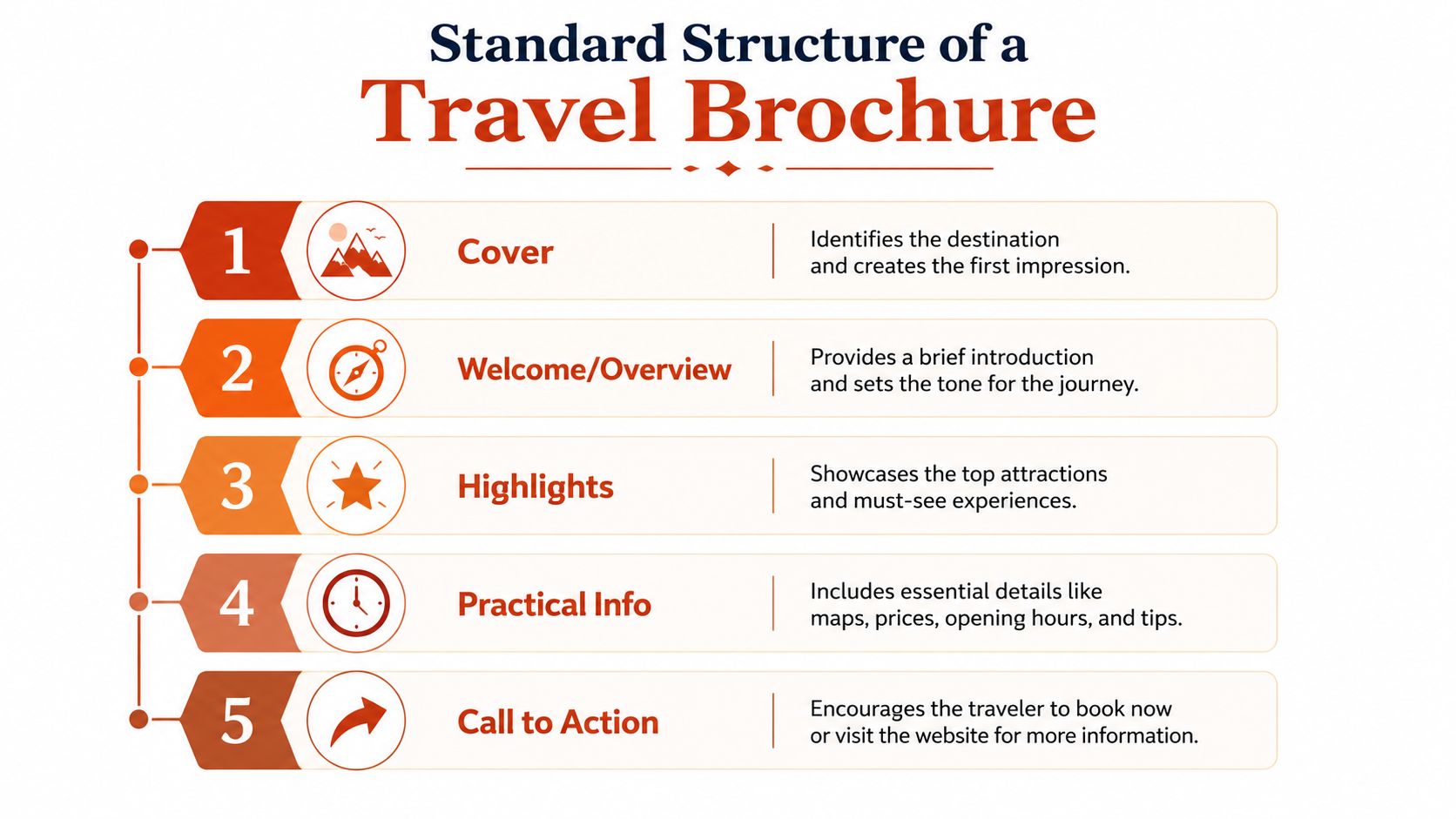
The structure is more predictable than most think. Educational frameworks from ReadWriteThink and Manitoba both describe the same core architecture, a place-identifying header, location detail, highlights, visuals, short persuasive copy, and a map ReadWriteThink guide. That's useful because it shows brochures aren't random layouts, they're a tested information sequence.
Start with place identification
The cover needs to tell the reader where they are before they do any work. A good title, a clear destination name, and a strong image do that quickly. The first impression should answer the question, “What place is this, and why should I care?”
Move into the overview and highlights
After the cover, the brochure should introduce the destination in short, readable blocks. ReadWriteThink's teaching guide calls for a brief summary of the setting, plus important places and location detail, and Manitoba's guidance adds a map and persuasive text that encourages people to visit same guide. You earn attention with a few well-chosen highlights instead of dumping everything onto the page.
Add the practical information
Travelers want logistics once the destination has sparked interest. Dates, prices, accommodation, dining, transport, and maps help them move from inspiration to action. DCatalog's standard sequence, cover, introduction, attractions, accommodations, dining, transportation, maps, mirrors that behaviour, which is why the order feels natural rather than forced brochure structure overview.
A clean brochure usually ends with a direct booking prompt. That final nudge matters because it stops the reader from leaving to search elsewhere for confidence, which is where conversions tend to drift away.
Print Brochures Versus Digital Brochures
Print still has a place because it works in physical settings where people browse with intent. Visitor centres, hotel lobbies, airports, and attraction desks are natural brochure environments, since the reader is already standing near a decision point. The tactile feel of a folded piece also slows the reader down just enough to look at the map, scan the copy, and notice the offer.
Digital brochures solve different problems. They can be shared instantly, embedded on websites, opened on mobile devices, and enriched with hotspots, video, or linked booking paths. They're also easier to update after distribution, which avoids the expensive cycle of reprinting when prices, dates, or inclusions change.
Trade-off: print can win on immediate physical discovery, digital can win on measurement and revision.
A flipbook viewer sits between the two. It preserves the familiar page-turning rhythm while adding trackable reading behaviour, so the brochure still feels like a brochure instead of a generic download. That's useful for tourism teams who want the look and flow of print, but also want to know what travellers read.
The main weakness of print is obvious, it's hard to measure readership once the piece leaves the rack. Digital formats fix that by showing page-by-page behaviour, and they can do it without turning the document into a disposable file. If the brochure is built as a living asset, it can be updated in place, shared again, and reused across campaigns.
For teams experimenting with browser-based brochure formats, the interactive PDF approach is a practical bridge because it keeps the document familiar while making it easier to distribute and measure.
Building Trust Beyond Polished Imagery
Travel brochures can lose credibility when they look too staged. A 2025 critique of brochure design argued that some pieces feel “staged, crowded, or artificial in real life”, and that complaint lands because travellers have learned to distrust over-polished marketing. If the brochure promises paradise but skips the boring details, the reader starts filling in the gaps themselves.
What builds confidence
The strongest trust signals are concrete, not cinematic. Transparent pricing with inclusions listed clearly, accessibility notes, seasonality guidance, safety information, and local customs help the reader judge whether the trip fits their needs. Realistic photography matters too, because images that show the destination as it appears are more persuasive than glossy scenes that look detached from the experience.
QR codes and digital extensions should be treated as core content, not a decorative add-on. They give travellers a direct path to live updates, verified reviews, and booking confirmation without asking them to search again. That's especially useful when the brochure is being used at the point of sale and the traveller needs reassurance fast.
Brochures earn trust when they answer the awkward questions first, not after the booking form.
What gets in the way
A brochure that hides fees, buries accessibility details, or leans entirely on atmosphere can backfire. Travellers read that omission as risk, even if the destination itself is excellent. The copy doesn't need to sound cautious, but it does need to sound honest.
Practical detail is not the enemy of inspiration. It's what makes the inspiration believable. A brochure that balances atmosphere with specifics tends to feel less like advertising and more like a useful trip companion.
Production Specifications and Design Rules
The physical build of a brochure shapes how people read it. A government tourism brief specifies a brochure spread of 59.50 cm × 42 cm, folded to 10 cm × 21 cm, using a 6-panel accordion fold on 80-lb matte art paper with offset printing and packaging in 100-piece packs and 1,000-piece boxes technical specification. That level of detail matters because panel size and fold order directly affect copy length, image placement, and map readability.
The production rules that actually matter
Standard trim sizes like A4, A5, Letter, and DL are common because designers already know how much content they can carry without crowding the page design guidance. Bleed and safe margins are just as important, with 0.125 to 0.25 inch bleed and 0.25 inch safe margins helping prevent cut-off text and broken image edges same guidance.
- Keep panel width disciplined: narrow panels force tighter copy and cleaner visuals.
- Map the fold before writing: the reading sequence should move naturally from cover to offer.
- Use captions intentionally: they let the brochure explain a photo without adding clutter.
- Leave room for maps and booking cues: if you cram the panel, the call to action gets lost.
The fold is more than a manufacturing choice. It sets the reading rhythm, which means the layout needs to respect how the brochure opens, not just how it looks flat on a screen.
Translating print rules to digital
Digital brochures still need hierarchy, spacing, and legibility. Text that works on paper can become cramped on mobile if the designer treats the screen like a scanned sheet. The right digital file keeps the same visual order, but adjusts for smaller screens, faster scanning, and clickable elements.
If you're briefing a designer, ask for a layout that holds together in both versions. The best brochure systems protect the image quality, keep the text readable, and preserve the logic of the fold whether the reader is holding paper or scrolling on a phone.
Distributing Brochures as Trackable Assets
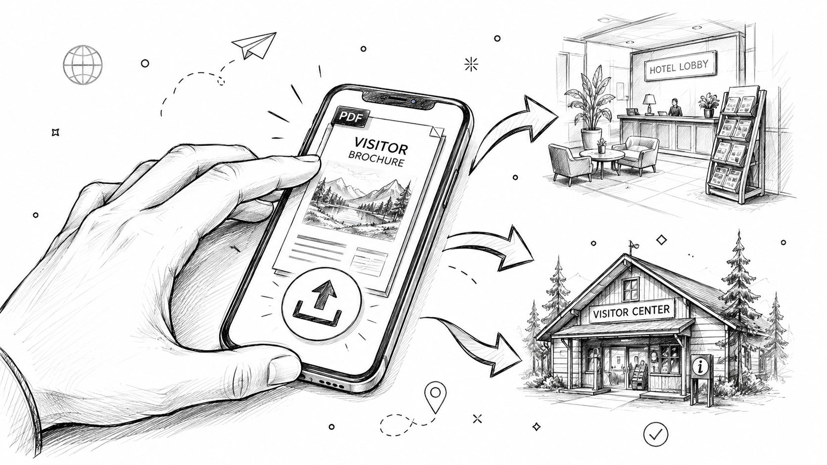
Distribution is where a brochure stops acting like a static file and starts working as a measurable marketing asset. EveryPage is one option for that workflow, because it lets a tourism team upload a PDF and generate a tracked link straight away, without forcing the sender or the reader to create an account. It also supports standard, flipbook, swipe, and magazine viewer modes, which lets the same brochure fit different campaign uses without rebuilding the content.
What matters is the reading data. PDF tracking workflow makes it possible to see page-by-page analytics such as views, time on page, read-through funnel, re-read rate, and document engagement scoring, so you can tell which attraction page, map, or offer held attention. Page-by-page analytics reveal which attraction pages receive the most revisits, which helps you prioritise the content that deserves more space in the next edition. That is far more useful than relying on download counts alone, because a download does not tell you whether anyone opened the brochure beyond the first spread.
Privacy still matters. EveryPage uses page-level reader analytics without storing IP addresses, which keeps the reporting GDPR-friendly while still showing how readers interacted with the brochure. For tourism teams working with international audiences, that gives you useful behaviour data without pushing the tracking model into a more intrusive direction.
Pricing is a practical part of distribution too. EveryPage uses flat per-account pricing, Free, Basic at $9/month, Pro at $29/month, with no per-user fees. For a marketing team, that can be easier to plan around than a structure that changes every time more people need access.
There are limits, and they matter. EveryPage does not include native e-signature features, so if the brochure also needs to function as a booking contract, a dedicated contract platform is the better fit. DocSend is stronger for enterprise compliance teams, while PandaDoc suits e-signature and contract workflows better. If you are turning a brochure into a trackable digital asset, the goal is not to add every possible feature, it is to keep the brochure readable, shareable, and measurable.
From Concept to Distributed Brochure
A useful travel brochure starts with a clear destination story. It needs a cover that names the place, interior pages that explain what matters, practical detail that answers the traveller's real questions, and a final prompt that makes booking obvious. Without that sequence, the brochure reads like a mood board instead of a sales tool.
The most reliable workflow is simple. Define the destination, structure the content around the standard architecture, design to print and digital specifications, choose the right distribution channels, and track what readers do. That gives you evidence you can use the next time you revise the piece.
Start with one brochure, not a whole catalogue. The data from real readers will tell you what deserves a wider rollout.
That approach works whether you're promoting a city break, a resort, or a multi-stop itinerary. A brochure can be updated, re-shared, and refined, so it's better to treat it as a durable asset than a one-time print run. Once you see which pages get read and which offers get ignored, the next version becomes much easier to shape.
If you're turning a brochure into a trackable digital asset, EveryPage gives you page-level analytics, no-reader-account sharing, and permanent links that can be updated in place. Visit EveryPage to see how it can support brochure distribution, reader tracking, and privacy-friendly reporting for your next travel campaign.
See who reads your next PDF.
Try EveryPage free